Chart Zabbix Problems and Config Data Without a BI Stack
Sometimes you do not need Grafana. You need answers like:
- Which problem names dominate the last week?
- Which hours of day are noisy?
- How uneven are tags / groups / hosts after a cleanup?
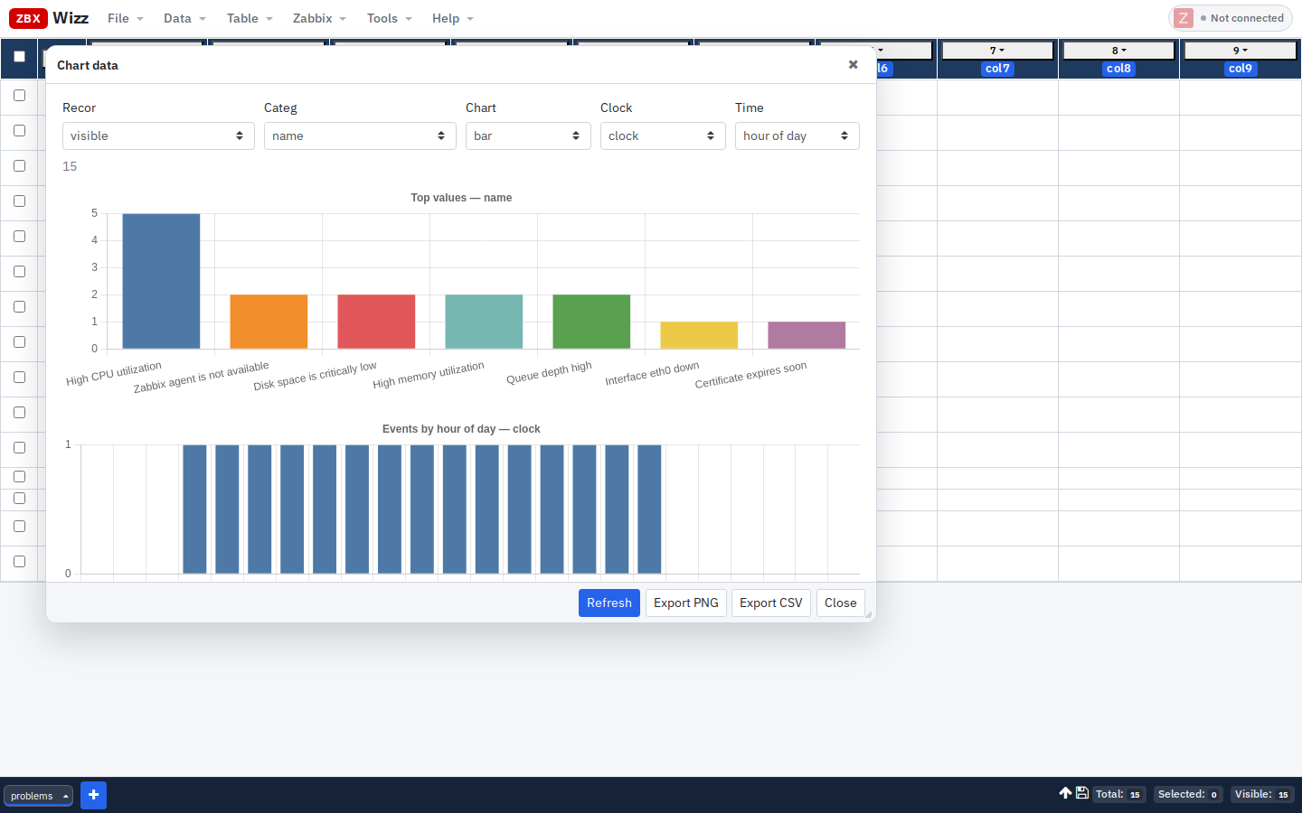
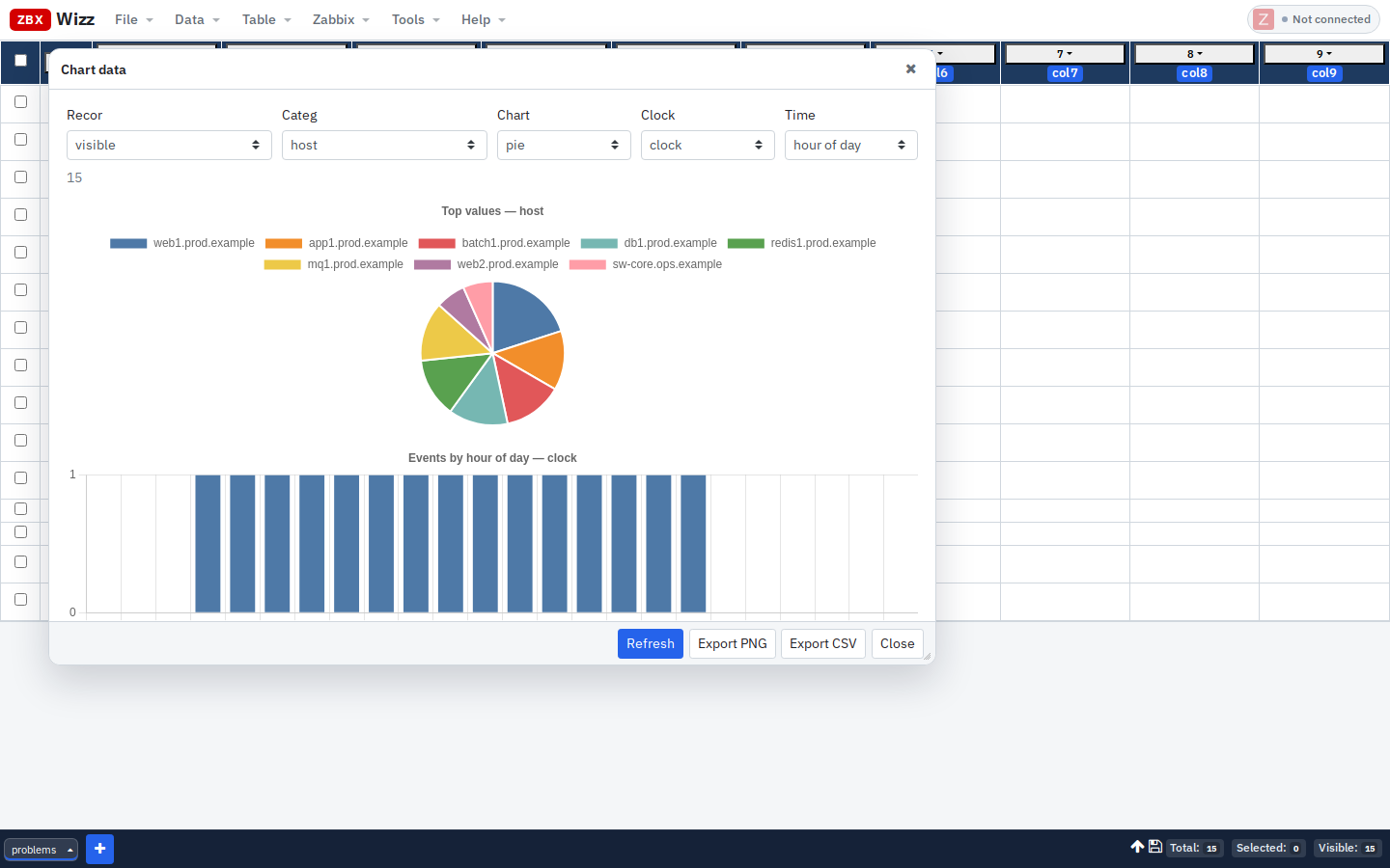
ZbxWizz can import problem / event (or any sheet you already have) and open Data → Chart data: Chart.js frequency bars/pies (top 20) plus optional time histograms. Charts respect visible rows, so filters are part of the analysis.
Workflow
Import problems/events (or hosts/tags)
        → Filter out noise in the sheet
        → Data → Chart data
        → Export PNG / CSV for the ticket or standup
No warehouse, no scheduled ETL — just the same workbench you use for Push campaigns.
1. Import recent problems
Data → Import → From Zabbix · Resource: problem:
{
  "output": ["eventid", "objectid", "name", "severity", "clock", "r_clock", "r_eventid"],
  "recent": true,
  "sortfield": ["eventid"],
  "sortorder": "DESC",
  "limit": 500
}
Time window with Unix seconds when you need a fixed range:
{
  "output": "extend",
  "time_from": 1719792000,
  "time_till": 1722470400,
  "sortfield": ["clock"],
  "sortorder": "ASC",
  "limit": 1000
}
For trigger-oriented history, resource event works similarly (see Examples).
2. Make clocks human (optional)
Column menu on clock → Format as date/time, or Transform:
formatUnix(self)Keep a raw numeric clock column if you still want time-bucket charts (the chart dialog parses Unix seconds or ms).
3. Filter before you chart
Examples:
- Exclude flapping names you already accept
- Severity ≥ 4 only
- One host group’s hosts (if you joined/Pulled host data)
Footer Visible count should match the story you want to tell. Charts default to visible records.
4. Open Chart data
Data → Chart data (under Export):
| Control | Use |
|---|---|
| Records | visible (default), selected, or all |
| Category column | e.g. name, host, severity, a tag column |
| Chart type | bar or pie (top 20 values) |
| Clock column | optional — enables time histogram |
| Time bucket | hour of day or calendar day |
Refresh after changing controls. Empty categories show as (empty).
Export PNG — attach to Slack/Jira. Export CSV — aggregated series for further work.
5. Config audits, not only problems
Same feature on configuration sheets:
| Sheet | Category column | Question |
|---|---|---|
| Hosts | groups / a derived env tag |
Is prod over-represented in the cleanup set? |
| Hosts | Transformed tier |
Template coverage by role |
| Macros | macro |
Which macros appear most often? |
| Macros | value (filtered to one macro) |
Value drift distribution |
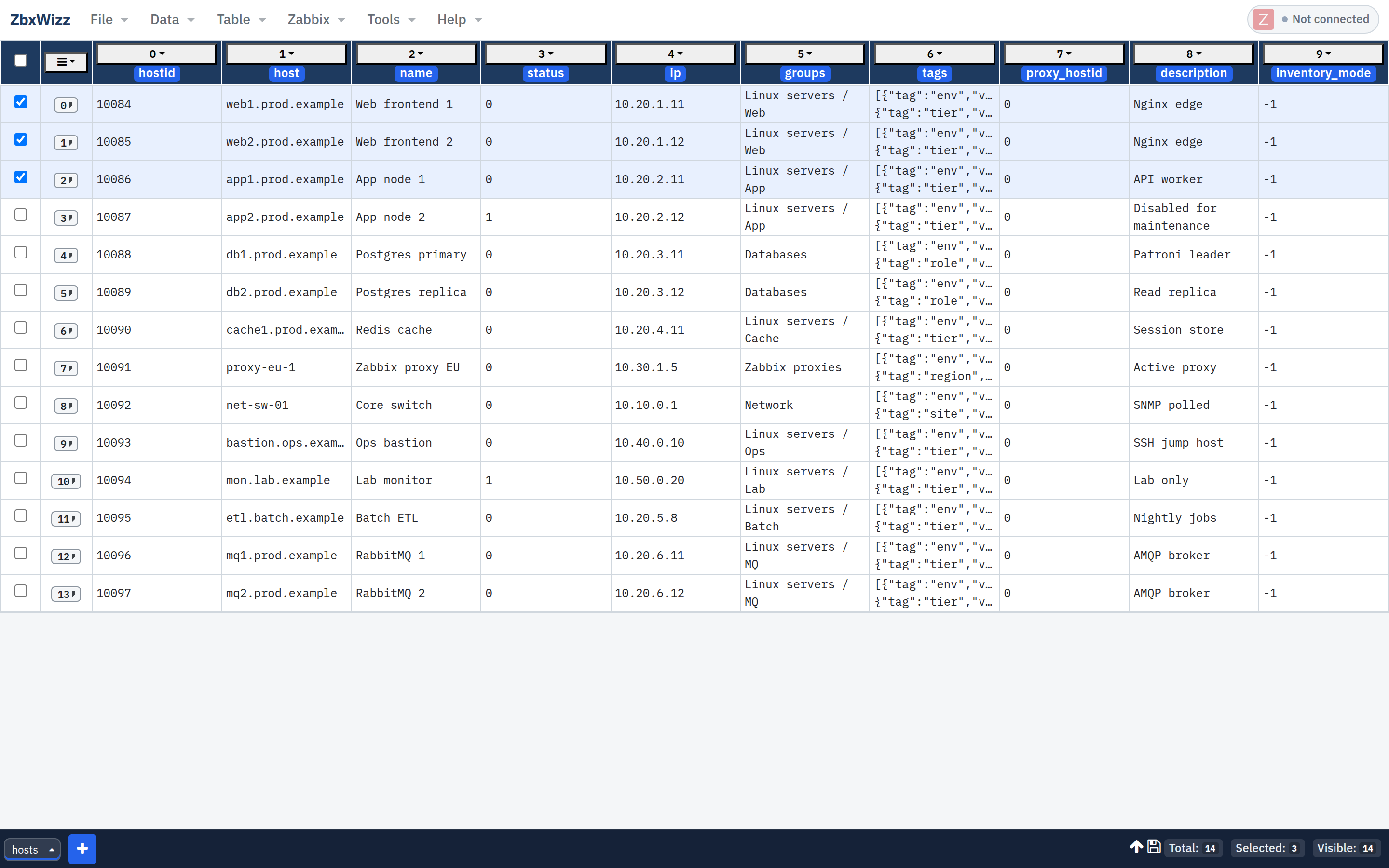
Example: after importing hosts with tags, Transform an env column, filter to the estate you care about, chart env.
6. From chart → action
Charts are for finding the shape of the mess. Fixing it is the rest of ZbxWizz:
- Filter the sheet to the hot category
- Select visible rows
- Transform + Push (tags, macros, disable, …)
- Re-import / re-chart to show the before/after in the next meeting
That loop beats exporting to Excel, charting there, then reinventing the write path.
Limits (so expectations stay honest)
- Top 20 categories by design — filter first for long-tail analysis
- Not a replacement for long-term metrics storage
- Large imports need an explicit API
limitand patience
For write-side tutorials: Mass tags & groups · Macro audit
— Sergiu, Creator of ZbxWizz